Behind the Scenes: Old Mill
This spring, we wrapped up our Old Mill project, which was one of our most dramatic before and afters. Our client’s space wasn’t functioning how they needed it to, but wanted to stay within the existing footprint on the first floor. With some creative reimagining of the floor plan, we were able to create a solution that provided the client with an improved, functional, and beautiful space.
Kitchen
The existing kitchen had an inefficient layout, bright orange countertops and backsplash, fluorescent acoustic tile ceiling lights, and outdated appliances. The window placement and exterior door constricted the amount of storage space in the kitchen. There was a powder room that ate into the footprint as wall, making the kitchen awkward and not functional.
We used the existing footprint of the kitchen to its fullest potential, only adding the extra square footage of the nearby powder room. This extra bit of square footage allowed us to add a pantry and have space to tuck the refrigerator away, panelling the front, and making it disappear. Centering a new double window gave our client space on either side of the sink for lots of additional storage. The exterior door was closed off, creating a space to display beautiful hand painted art. The existing opening into the adjacent dining room was increased, making the kitchen feel much larger and improved the circulation between the spaces. A custom island with seating, a custom hood, and petite lighting round out the space.
Mudroom, Powder Room, + Office
The existing den had floor to ceiling paneling, acoustic tile ceilings, shallow and not functional shelving, and overall, the space did not function how our client needed it to.
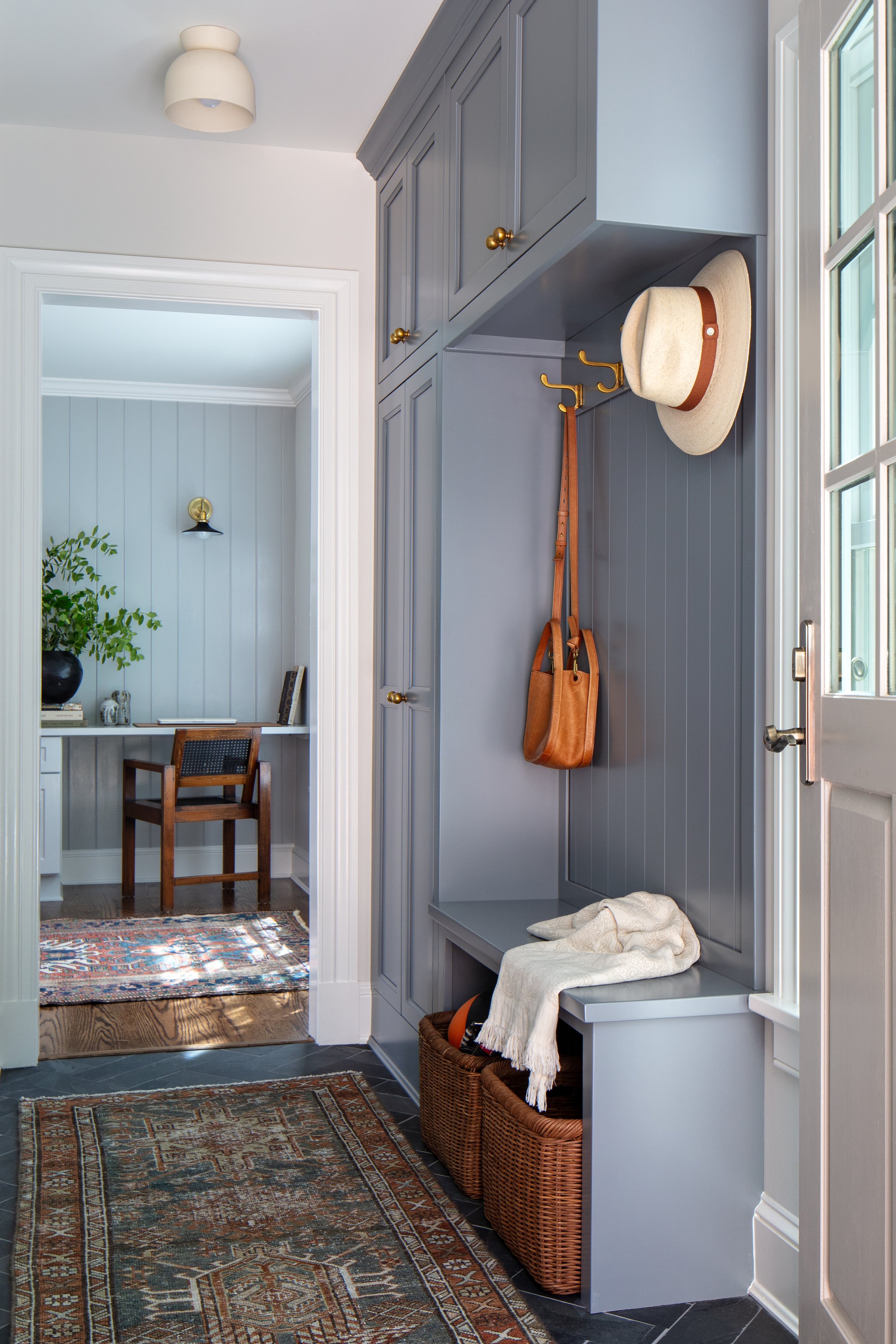
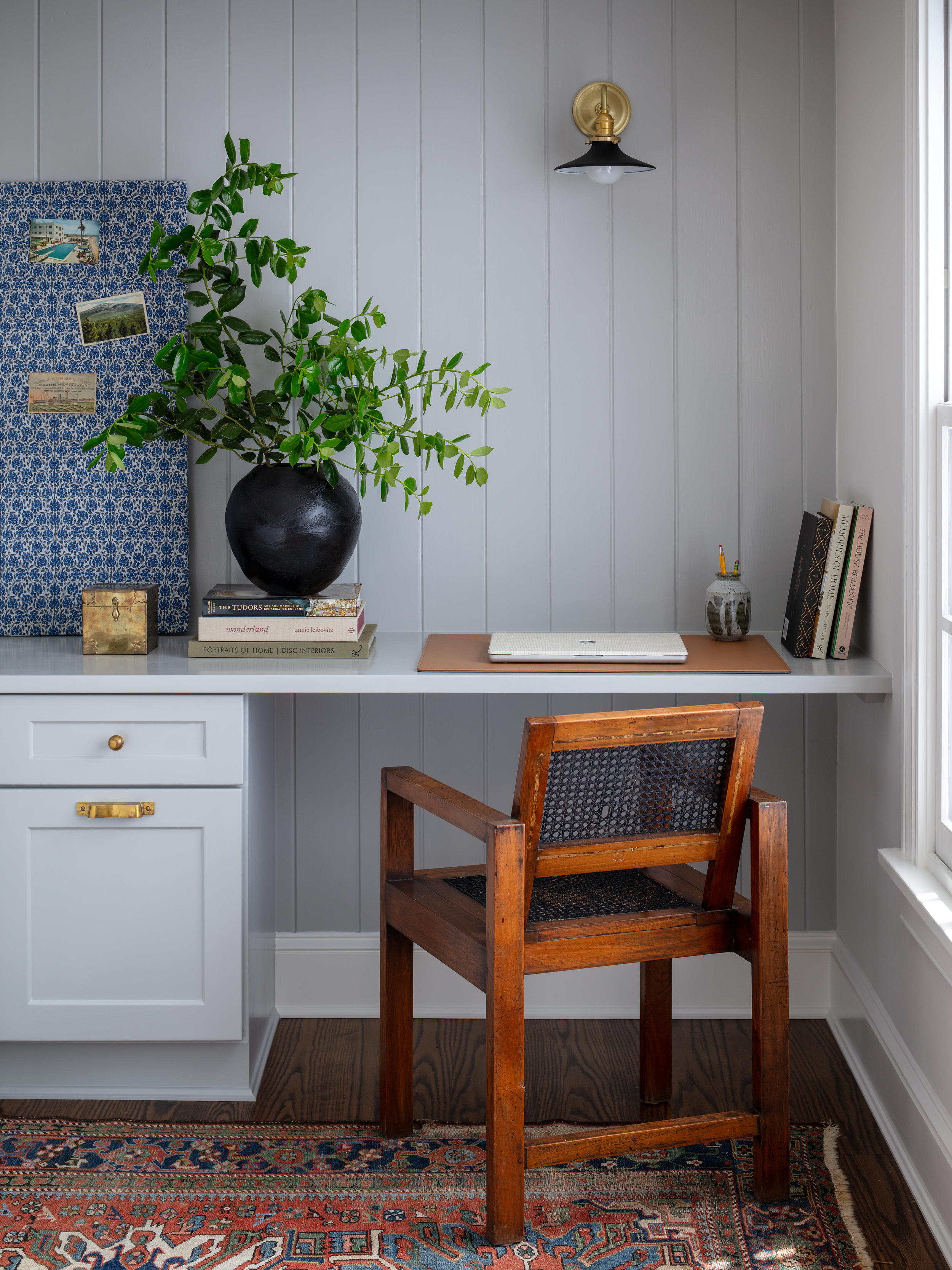
We divided the existing den into the mudroom, relocated powder room, and office, allowing each of the spaces to serve their distinct functions. The existing window and exterior door remained, and custom cabinetry was added to provide storage that was lacking before. The powder room was relocated from the kitchen, refreshed with a fun wallpaper and beautiful brass light. The office now has a built in workstation instead of shelving, which was more functional for our client.


